
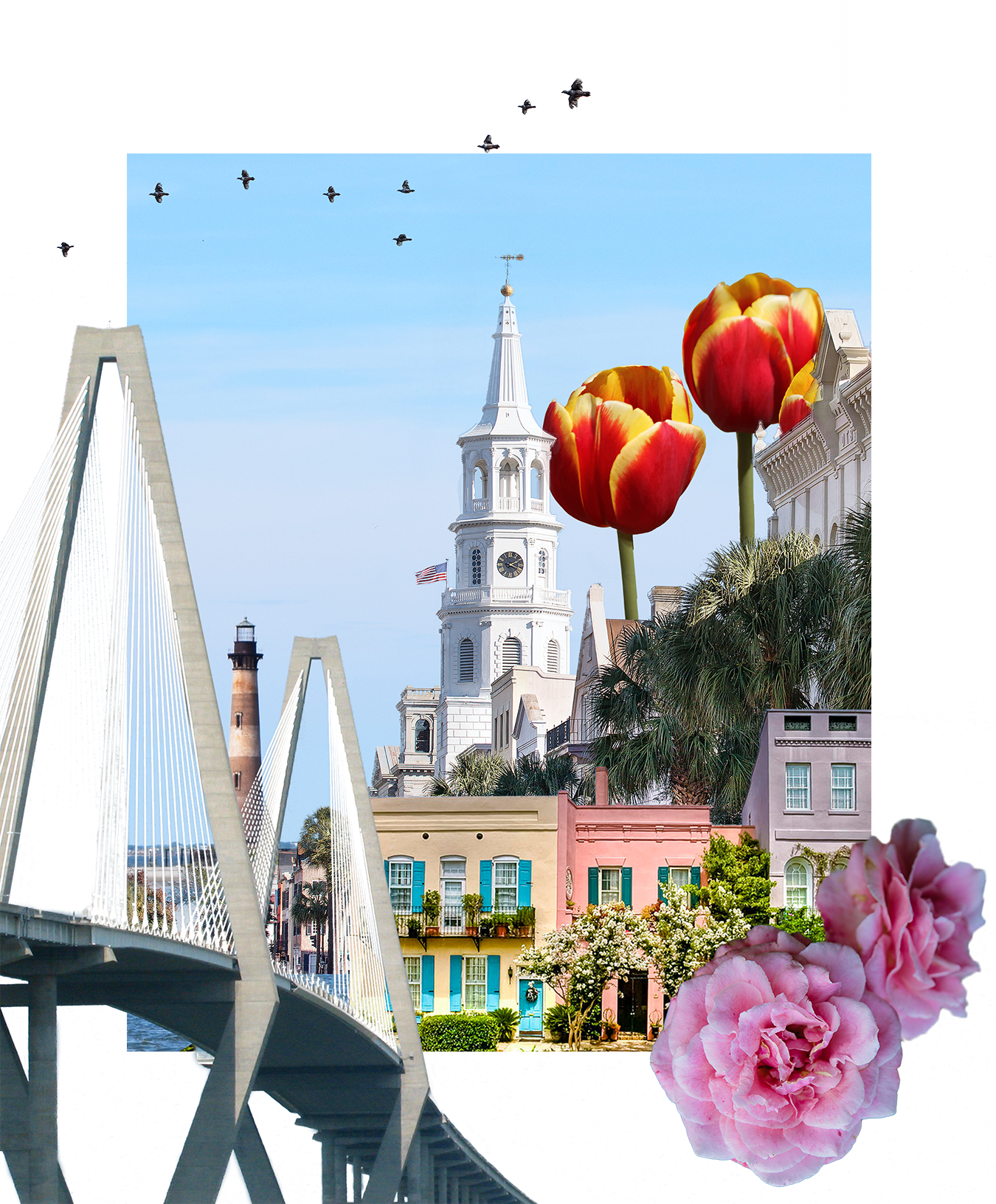
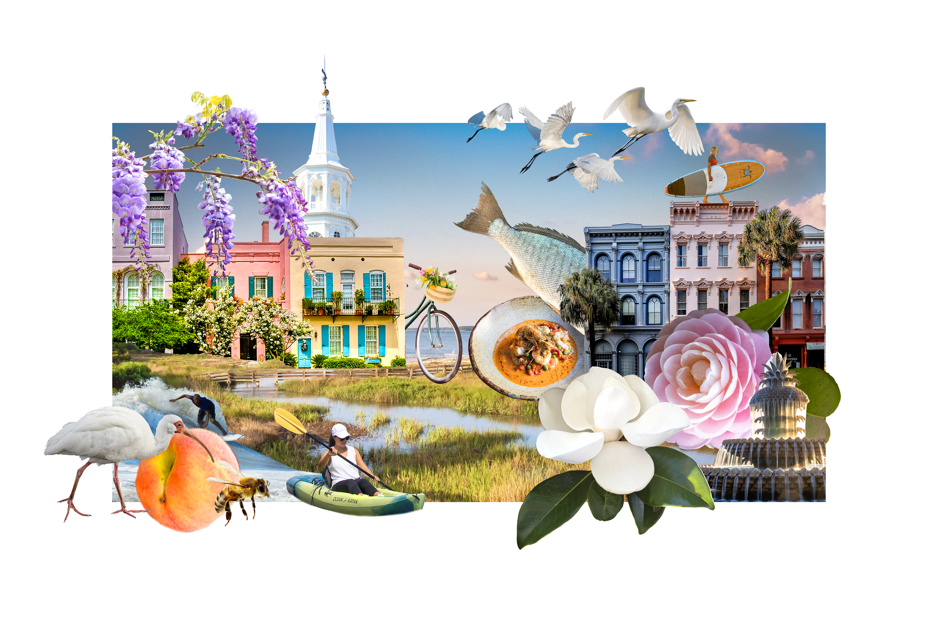
Client Pitch - Explore Charleston
This project was a pitch to our client, Explore Charleston, for a collage that would run in the print magazine promoting tourism.
After many iterations, I created one that our publisher wanted to pitch.
This proposal resulted in the client purchasing three spreads in our upcoming issue.

Ad Email GIF - Introducing Our New Look

Our publisher emphasized a desire for speed and bright colors to grab attention for our upcoming rebrand.
Creating smooth animation in a GIF with a small enough file size to be embedded in an email was a fun challenge.
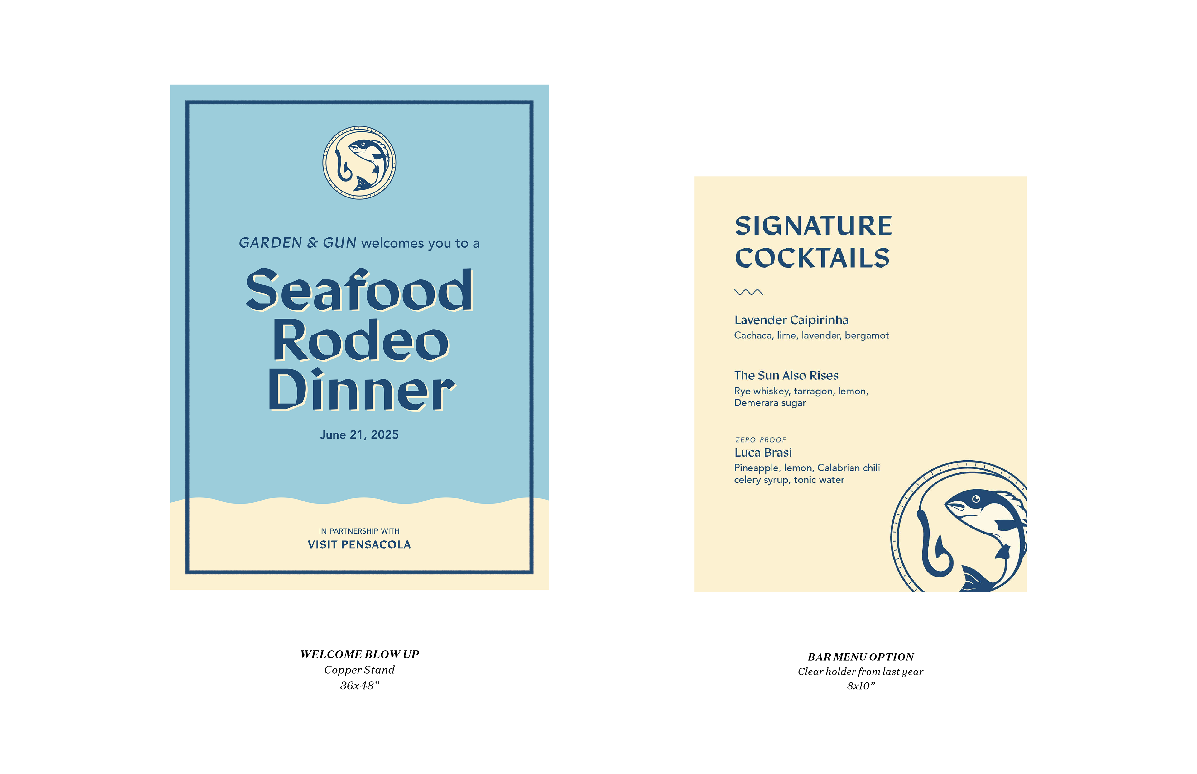
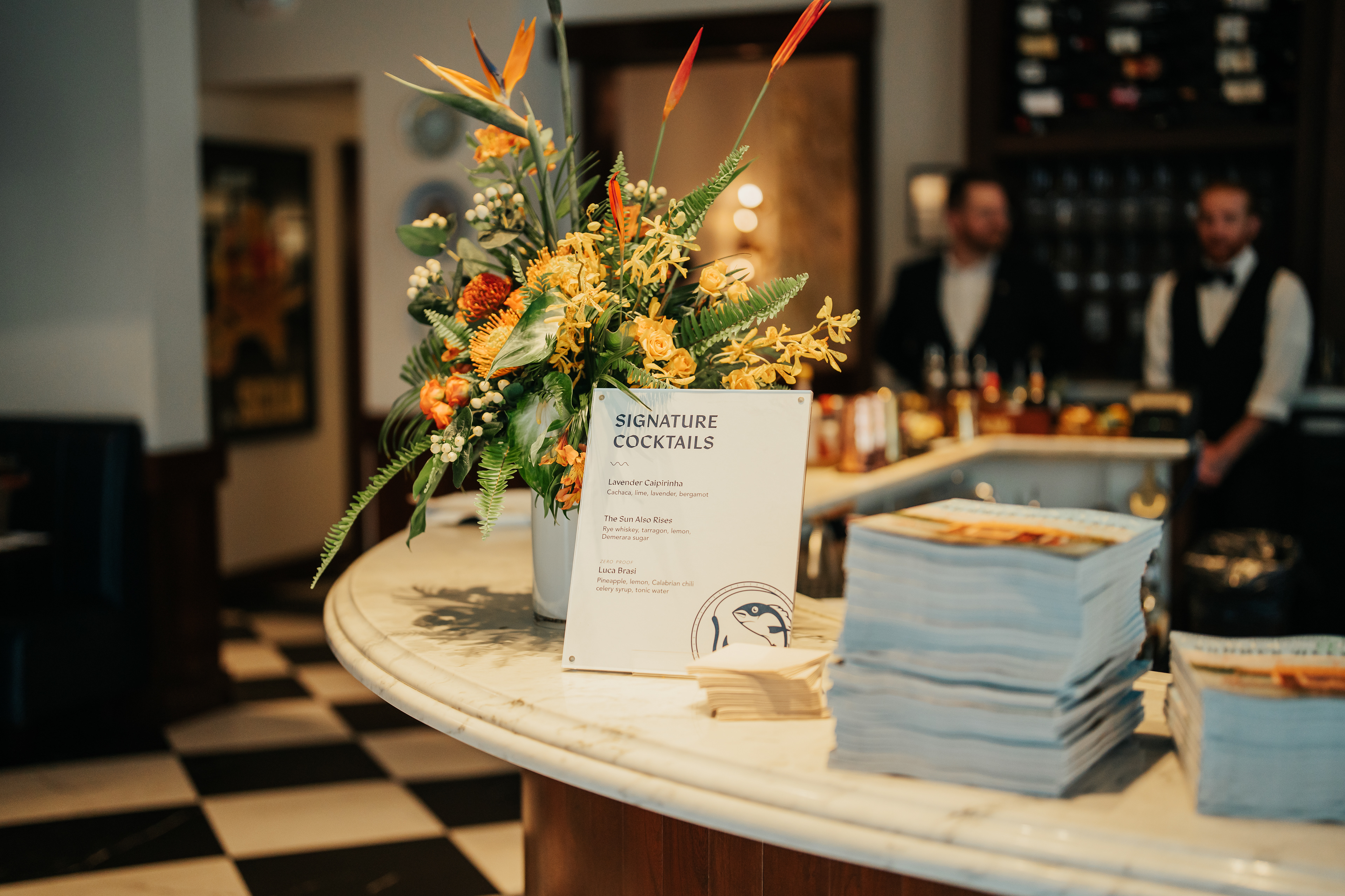
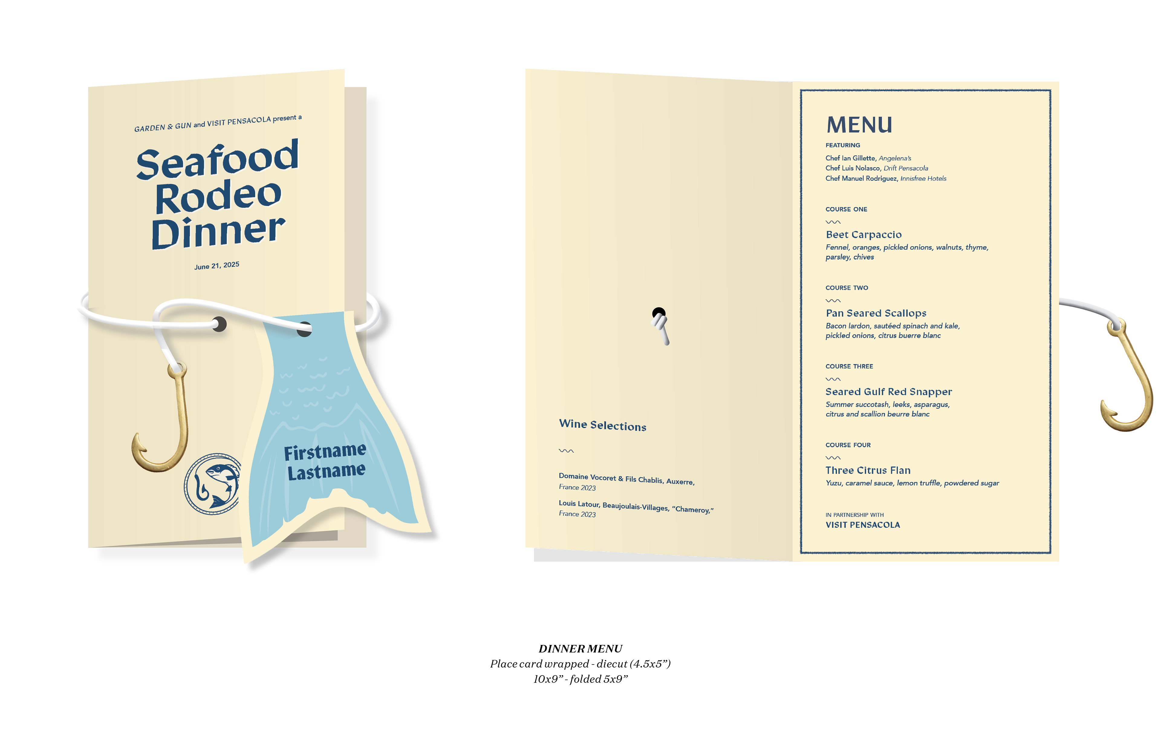
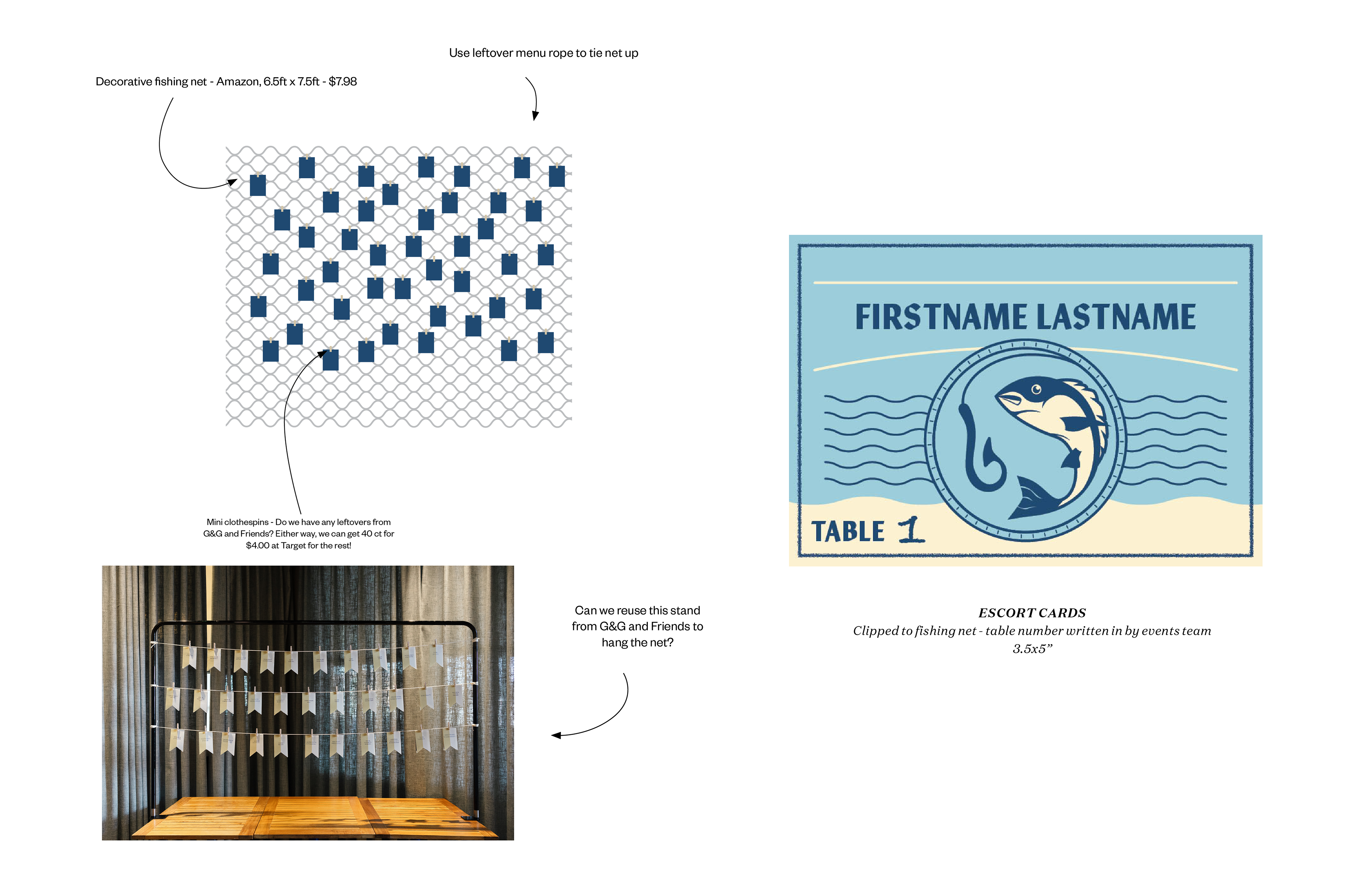
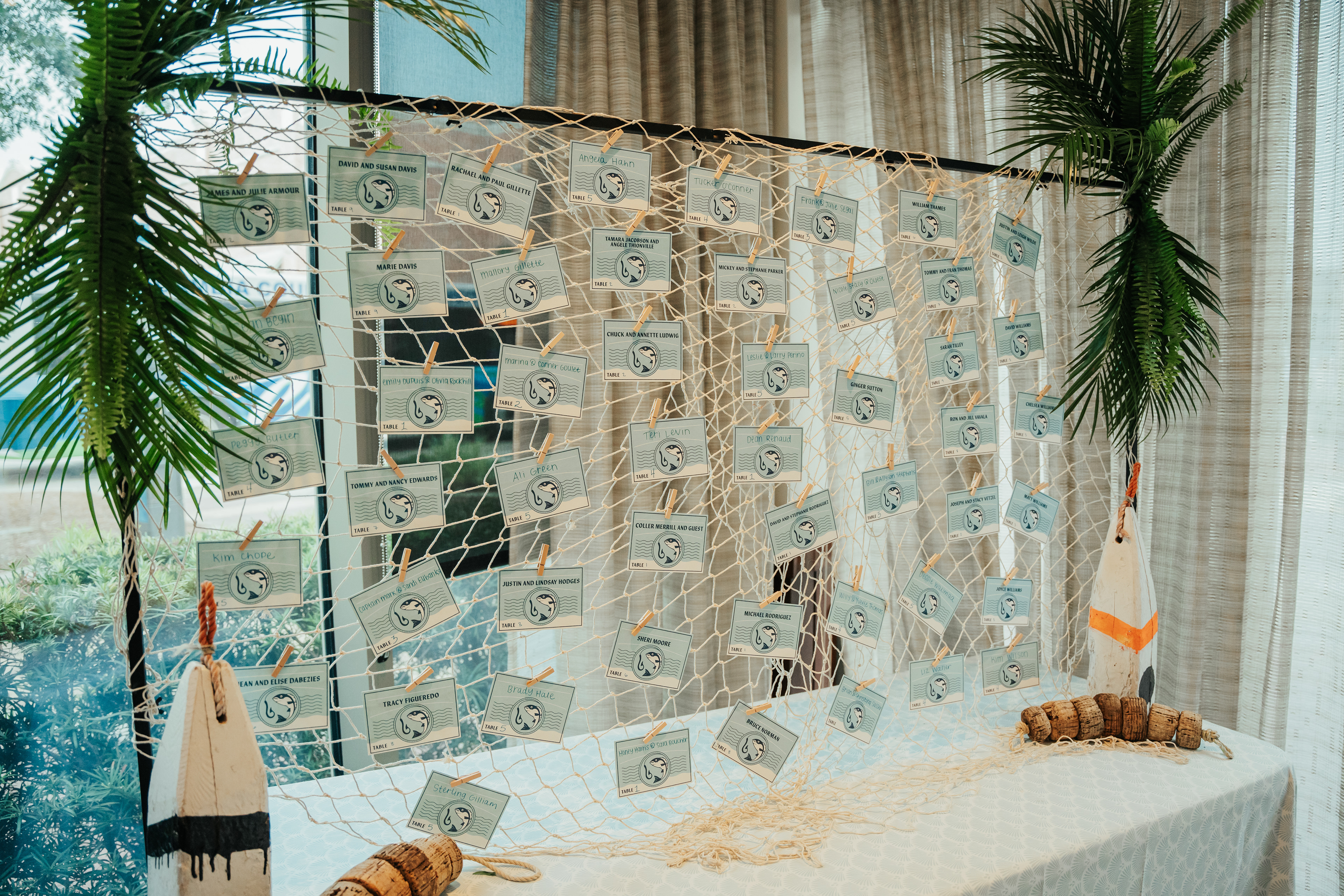
Seafood Rodeo Event Materials
I was granted the role of primary designer for the print event collateral for this the 2025 edition of this annual event.
Below you can see the mock-ups that were approved by our directors and real event images from the final result.

Taste of Tennessee Event Refresh
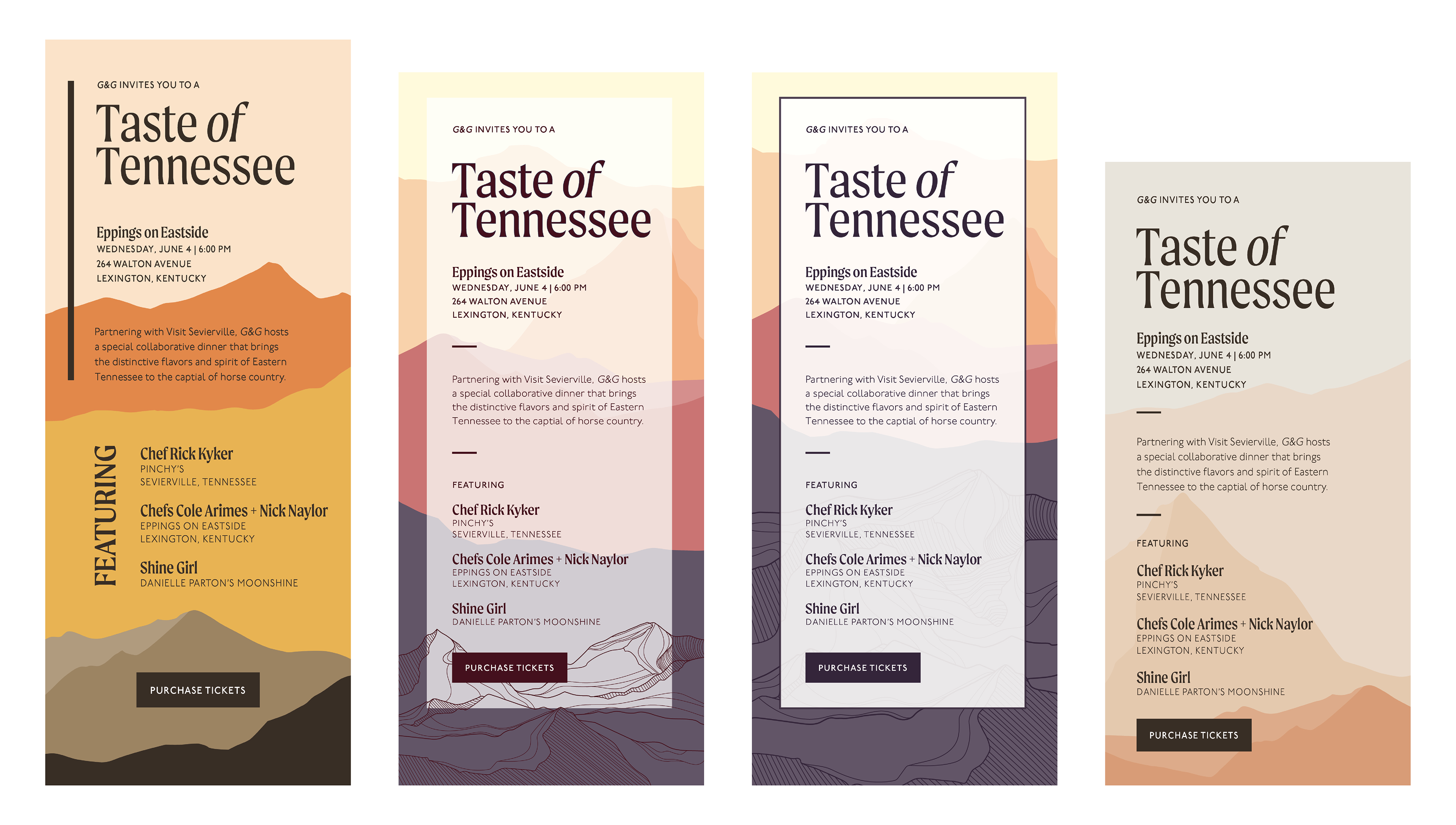
After the design was approved, my team requested I redo the final illustration to better reflect the rolling mountains of Tennessee.
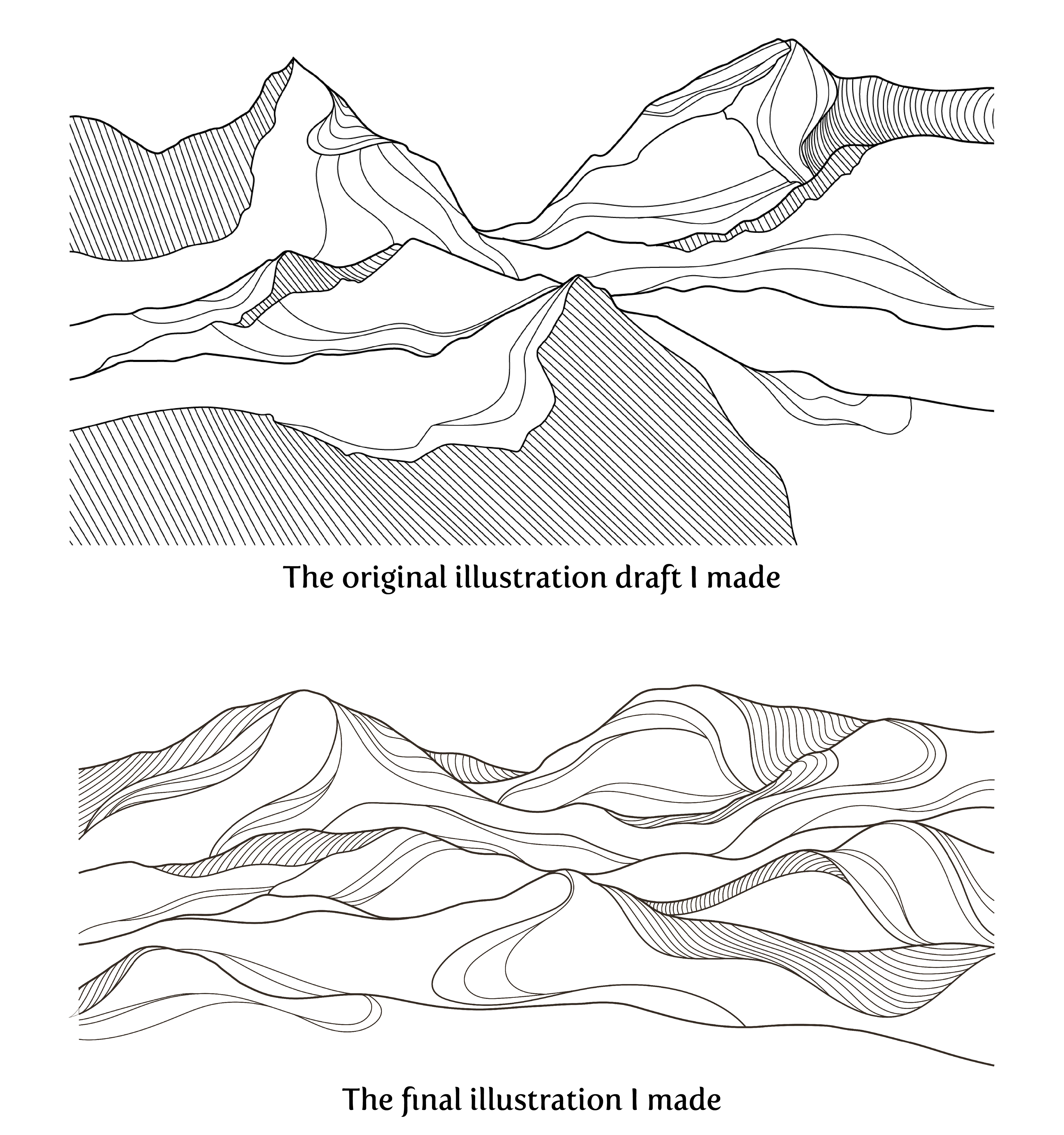
Photo Editing
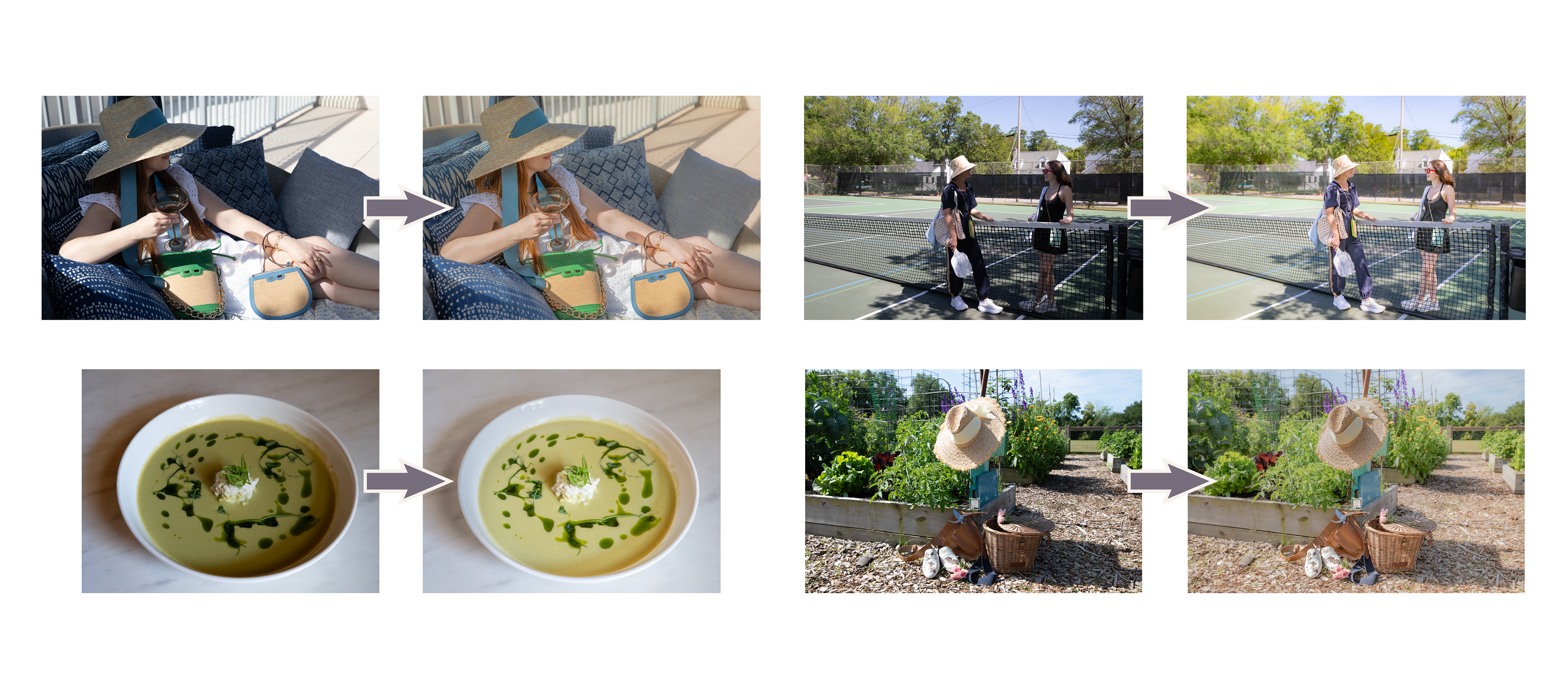
I edited galleries of photos taken by our digital team.
Based on my work on these galleries our creative director requested I lead a photo editing seminar for the digital team to show them some Lightroom basics.